WHO?
Interwest Design is a printing/packaging/design company based in Salt Lake City. The company was a branch of the Go Interwest Group started in 2015 and closed its doors in 2018. They were a full service shop that would handle everything from graphic design, packaging, print/signage, and shipping/fulfillment (through their sister company Interwest Transportation)
WHAT?
They wanted me to create the logo, branding, advertising, UI/UX, and packaging for them and their customers. The goal for the branding was to create a bright, exciting, modern and fun identity. These designs not only looked great, but brought in thousands of dollars of revenue, by attracting customers to us.
HOW?
I was hired on the company as the Creative Director/ UX/Package Designer. I handled the brand identity, marketing, UX, as well as graphic design for the customers. I also pre-pressed the designs for printing, and handled the customer billing and fulfillment.
All of the products & examples in these materials were also designed by me for real companies.
Logo brainstorm
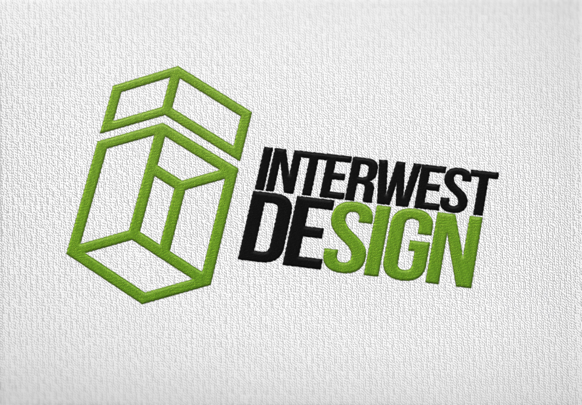
I went through many different ideas for the logo. Below are just a few of the favorites.
Final Logo Design
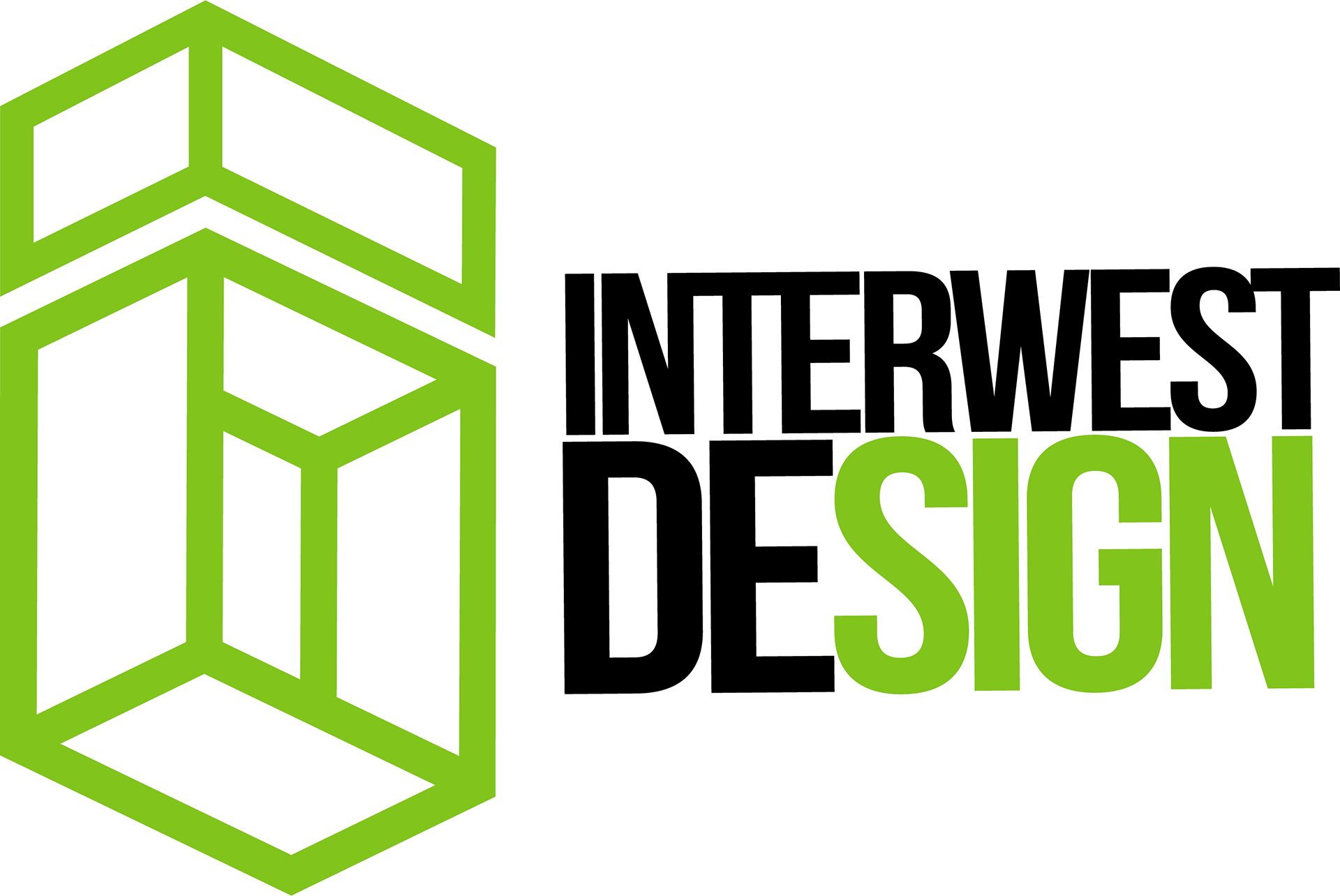
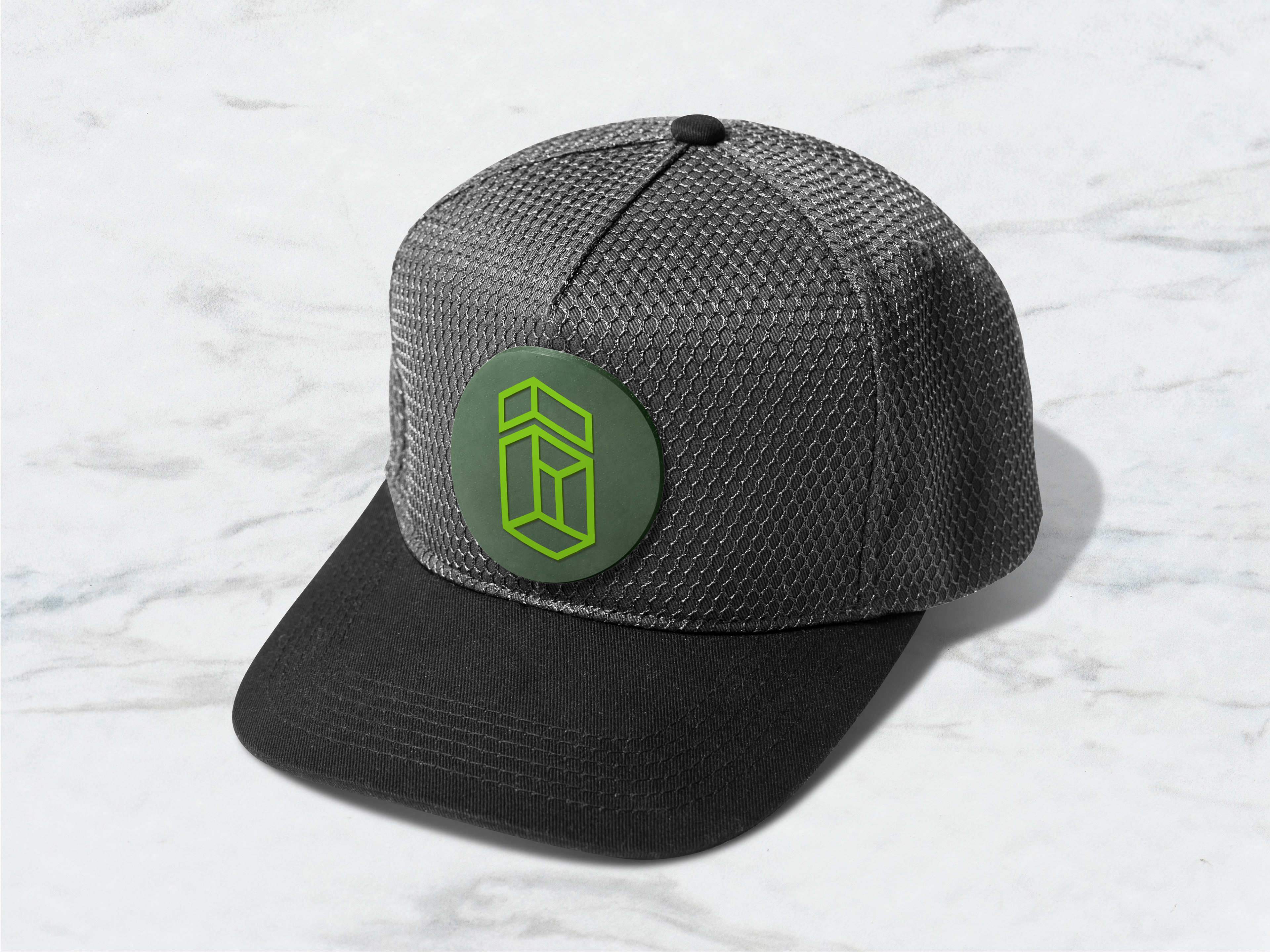
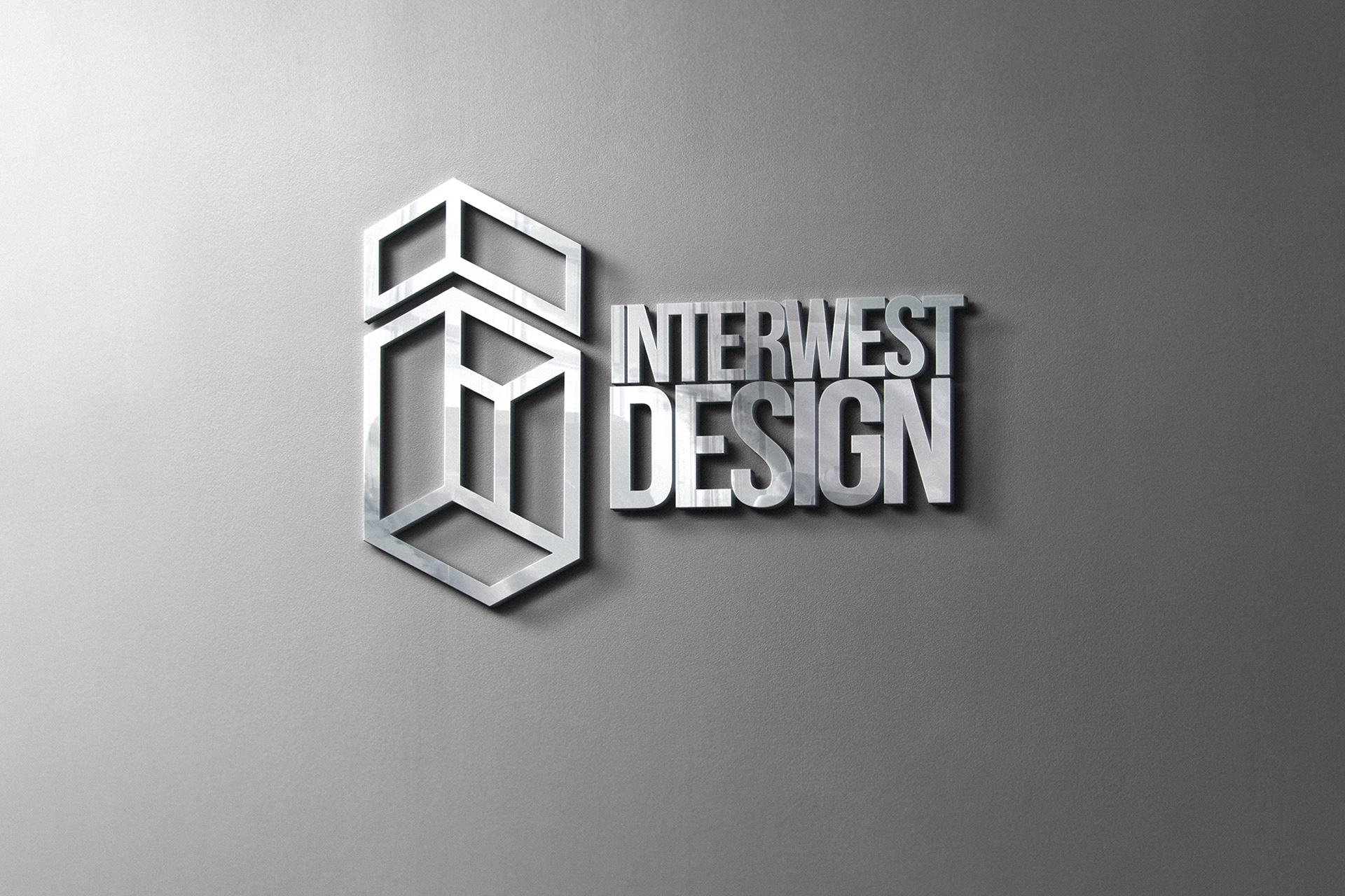
The emblem respresents a box which is the main product of the company. It also has a letter I, and D to represent the name of the company.

Trifold design
We went through 5 different designs before we chose this one. The pops of color and geometric shapes match the rest of the branding, and also make it more exciting and fun feeling. We really wanted to show off all the different capabilities without overloading the customer with too much info.
Each of the photos were taken by me of products designed by me for Interwest Design.
A-frame Signs
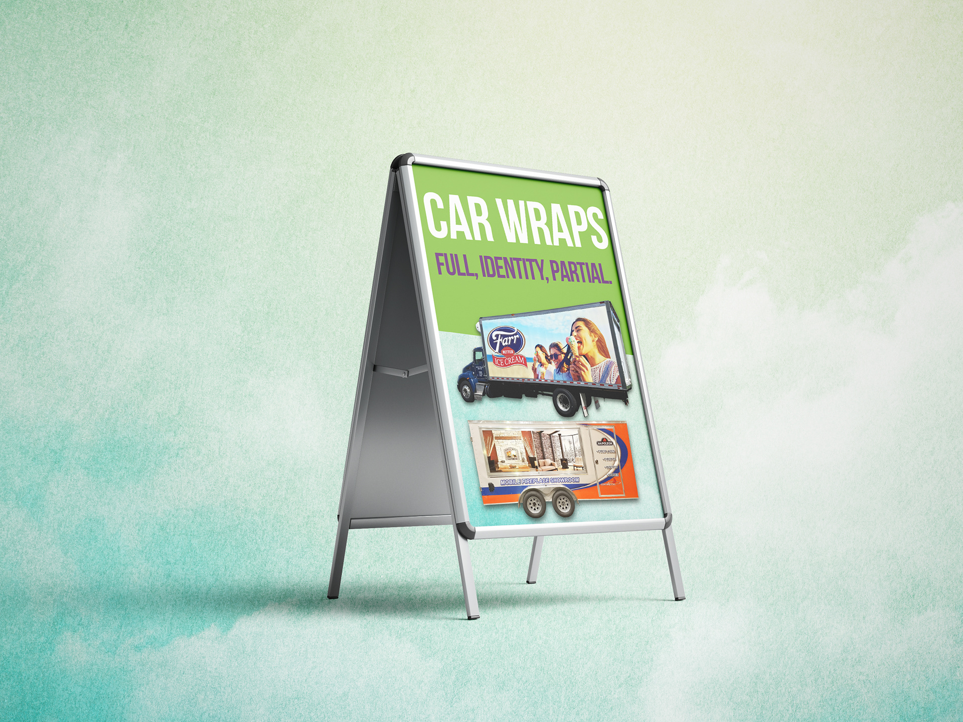
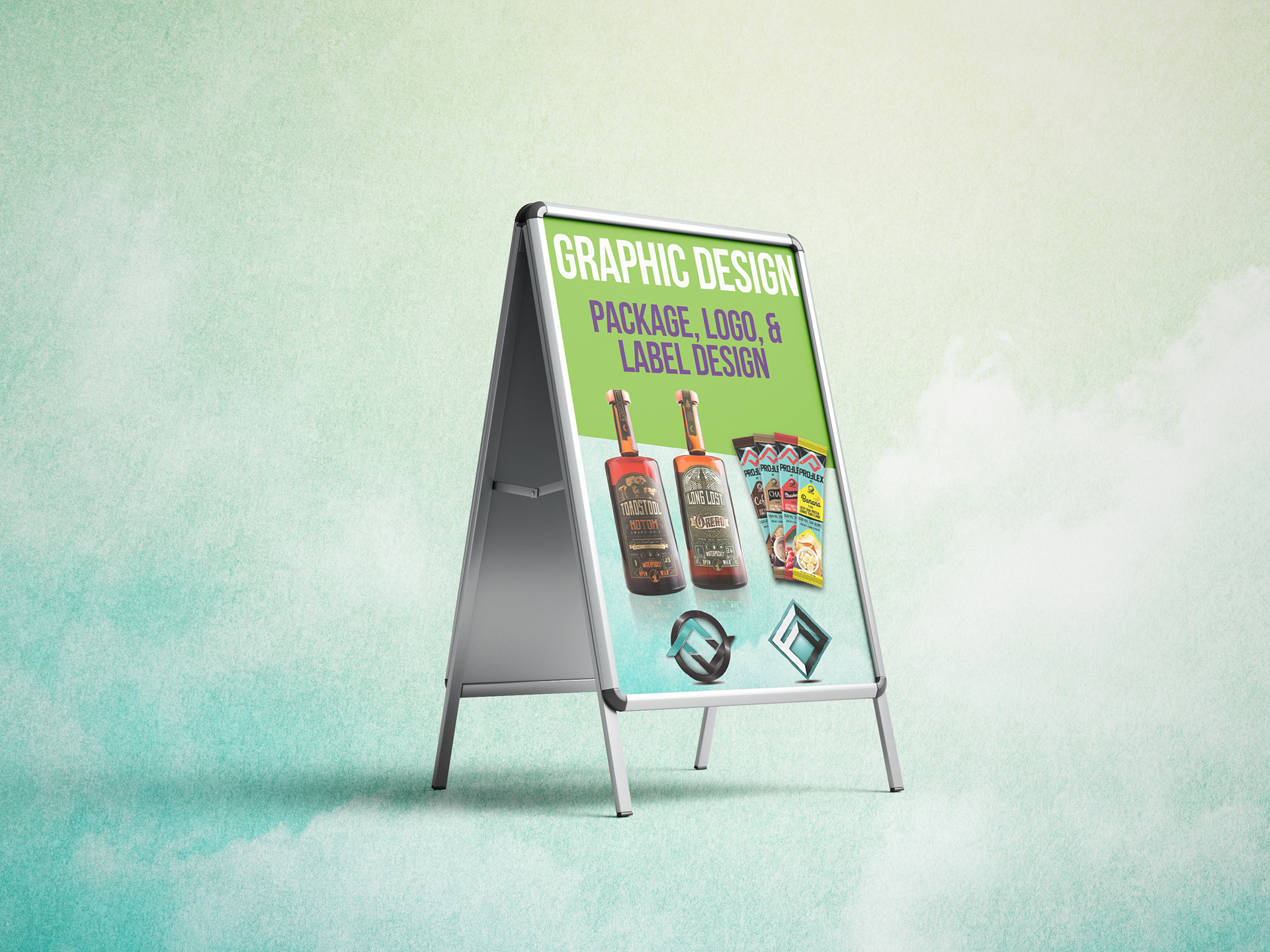
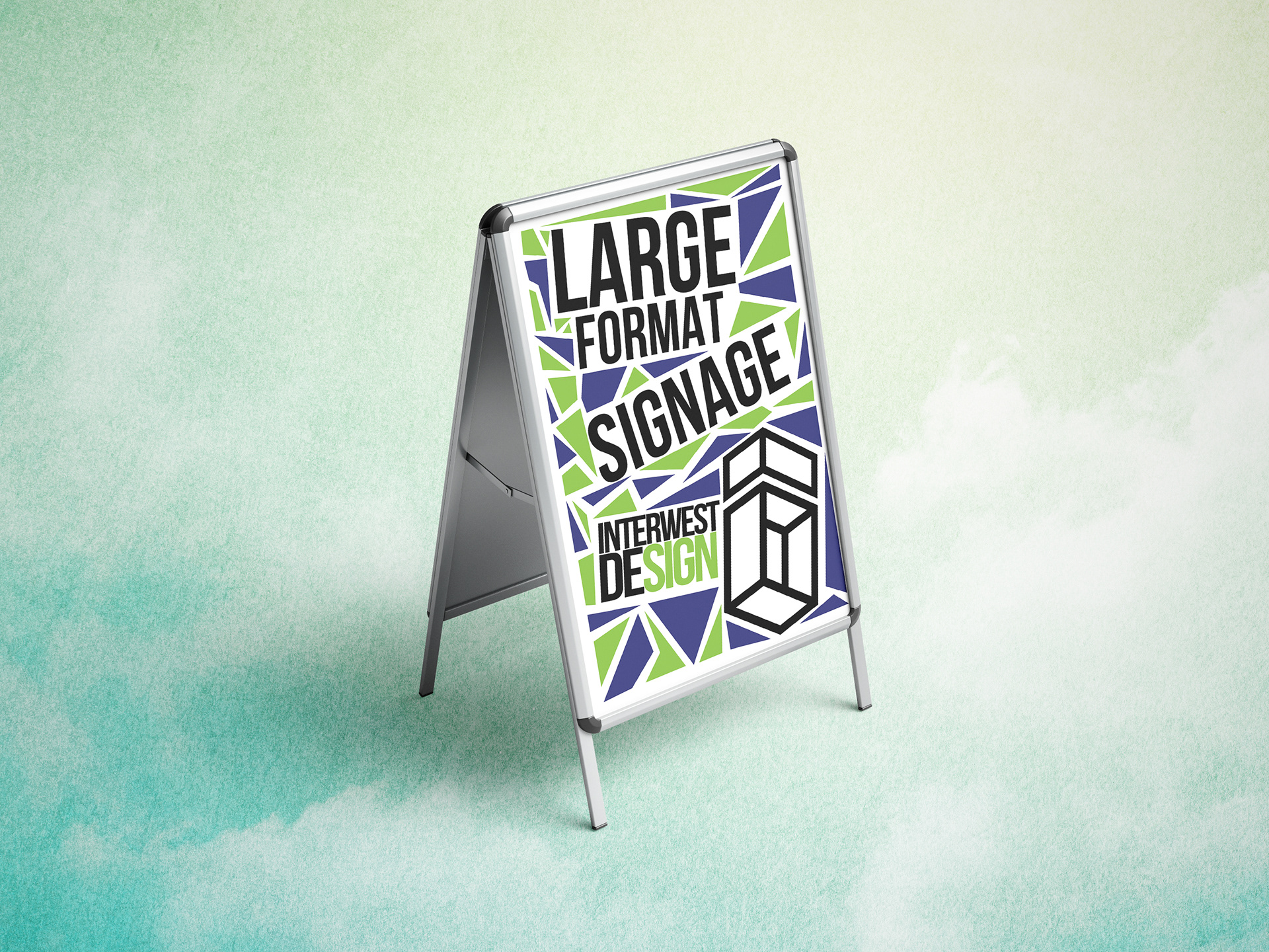
Each week we would put out a new sign to catch peoples attention driving by. These represent 2 different styles of design for different weeks. We went through 5 different designs before landing on these ones. The owners goal for these signs was to grab peoples attention as they drove by. I designed them to be eye grabbing, and also easy to read in 2 seconds or less.

Rack Card Design
The goal of these cards was to be essentially a large businesscard that tells a small story about what we do, but mainly just gives them our contact information, and get them thinking about us. I made 2 different ones that were both unique. These both had unique purposes to give contact info, and to get them thinking about us.
UX/UI Design
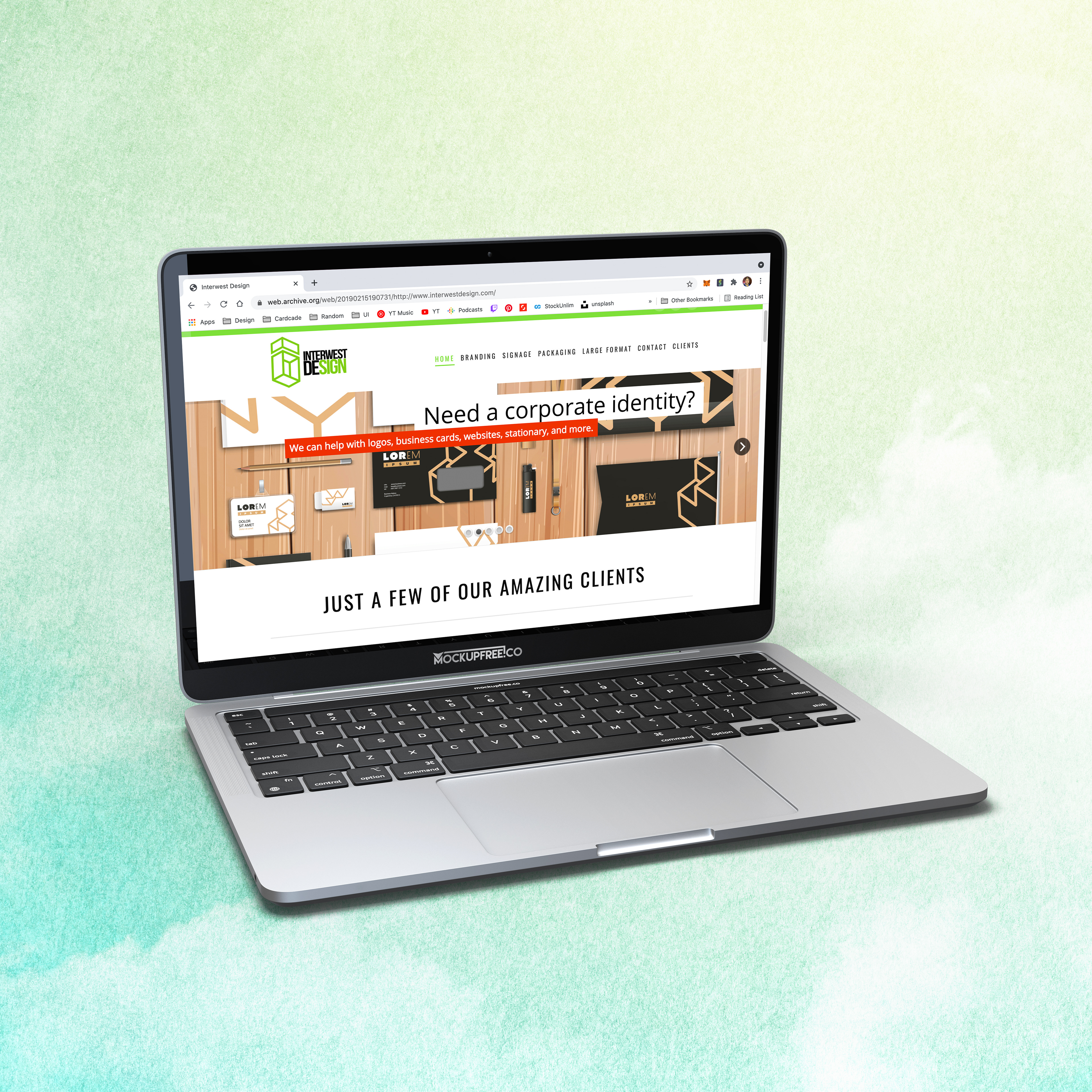
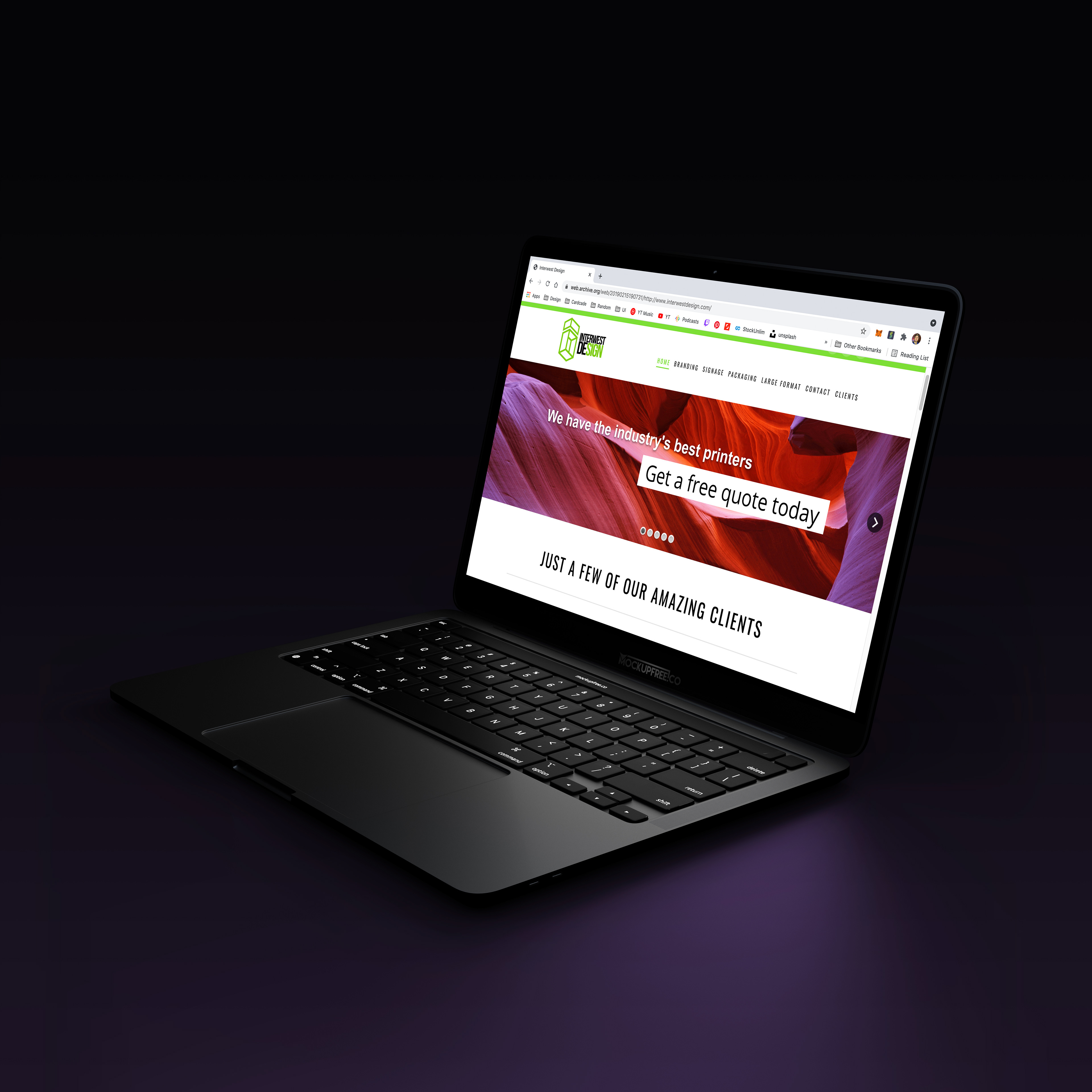
The goal of the site was simple, to gain more customers.
After creating sketches, prototypes, and mockups I then I coded the website using wordpress, with some CSS and HTML.
We then tested the website with our customers to get their opinion on its usability, and effectiveness. 100% of the users loved it, and we gained tens of thousands of dollars of revenue from people using the website.
Package design
The goal of this design was to create a eye catching box that we would give to customers at our golf tournament. This would act as a billboard to get the customers thinking about us and one day use us for their printing.
We gave out 50 of these and we ended up printing for 20 of them. So overall it was a success.
