Background
Progressive Leasing
Progressive Leasing is a fintech company that partners with retailers nationwide to lease products to the credit challenged consumer.
User Personas
Who are the users?
"Michael" & "Maria" (Our main demographic) frequently posture a confident air, but often find themselves overwhelmed with their financial reality.
With spending priorities and behaviors that can seem undisciplined, they frequently become financially overcommitted.
Despite confidence in their financial skills and knowledge, they struggle with awareness of funding options(research), approval requirements(get denied), and affordability (late & missed payments).
Role
A team of 6
1 Product manager, 3 Developers, 1 QA, 1 Product designer
Tools: Figma, Usertesting.com
Problem
How to get more app downloads?
• Why do we want to get more app downloads? Increasing app downloads will give users a better experience by giving them access to the latest and greatest features like ProgMarketplace which allows users to shop a catalog of leasable products.
• If users have our app they are more likely to come back and use our services again in the future.
Solution
Advertise, and make it easier to get the app
• Obviously advertising our app to users in more places would help increase downloads.
• We know that finding and downloading a new app can be a little annoying and tasking so we wanted to decrease the friction as much as possible.
Research
Competitive research and analytics
I wanted to see how other companies were advertising their app. I also wanted to see how they decreased the friction of finding and downloading the app.
According to my competitive analysis many competitors and large companies gave the option to scan a QR code as well as receive a text with a link to download the app when on desktop.
Design
Exploration
We did a lot of exploration (see below), not only on the look and feel of the CTA but where it would be placed to get the best adoption.
Design
High fidelity prototype
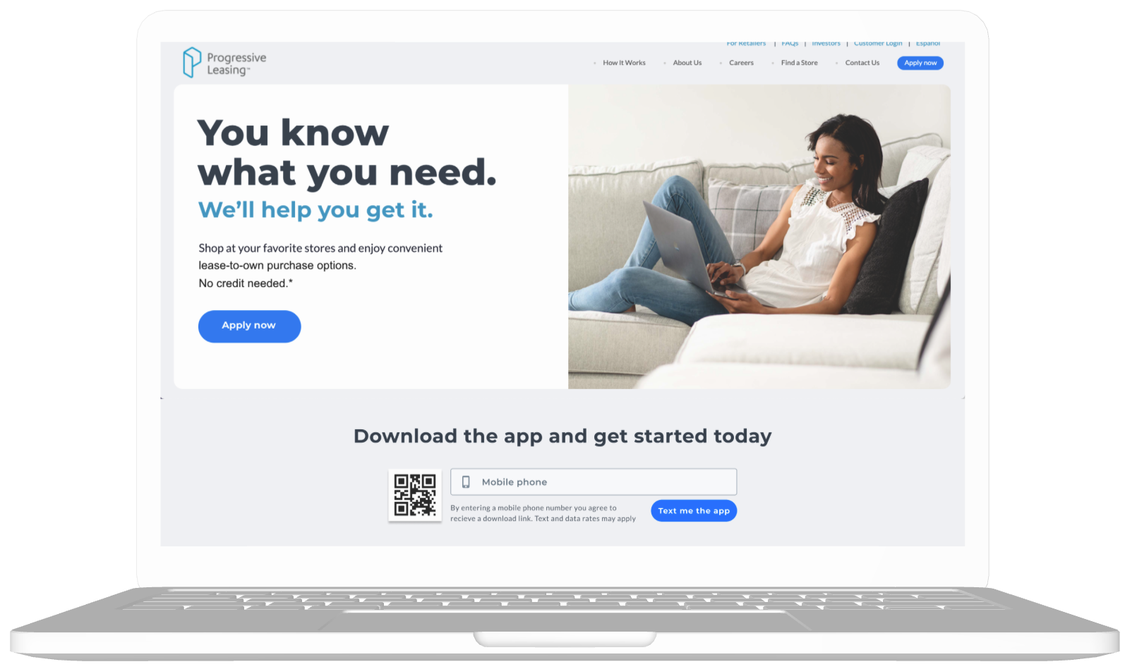
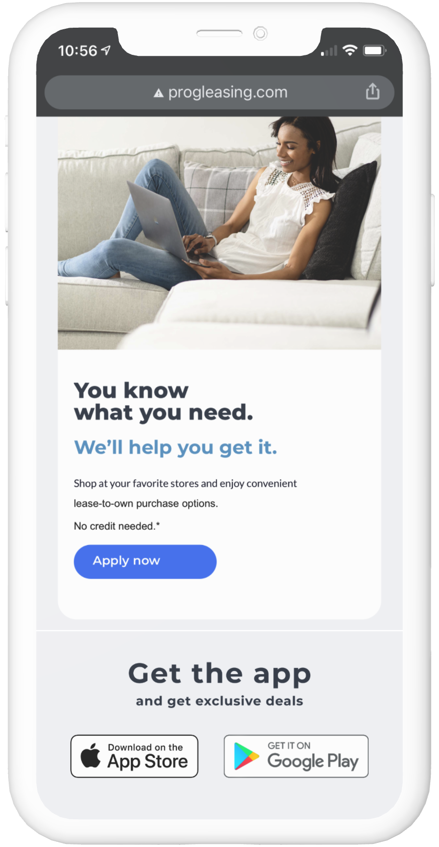
We decided to place a CTA in two areas with the most traffic.
• Dashboard (mobile web, & desktop)
• Log in (mobile web, and desktop)

Dashboard (Mobile)
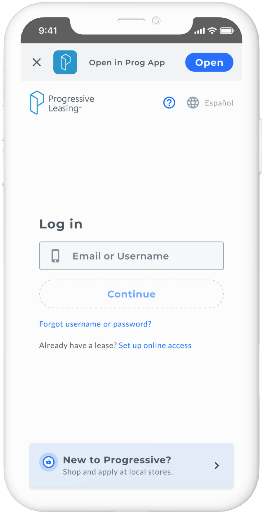
Log in (Mobile)
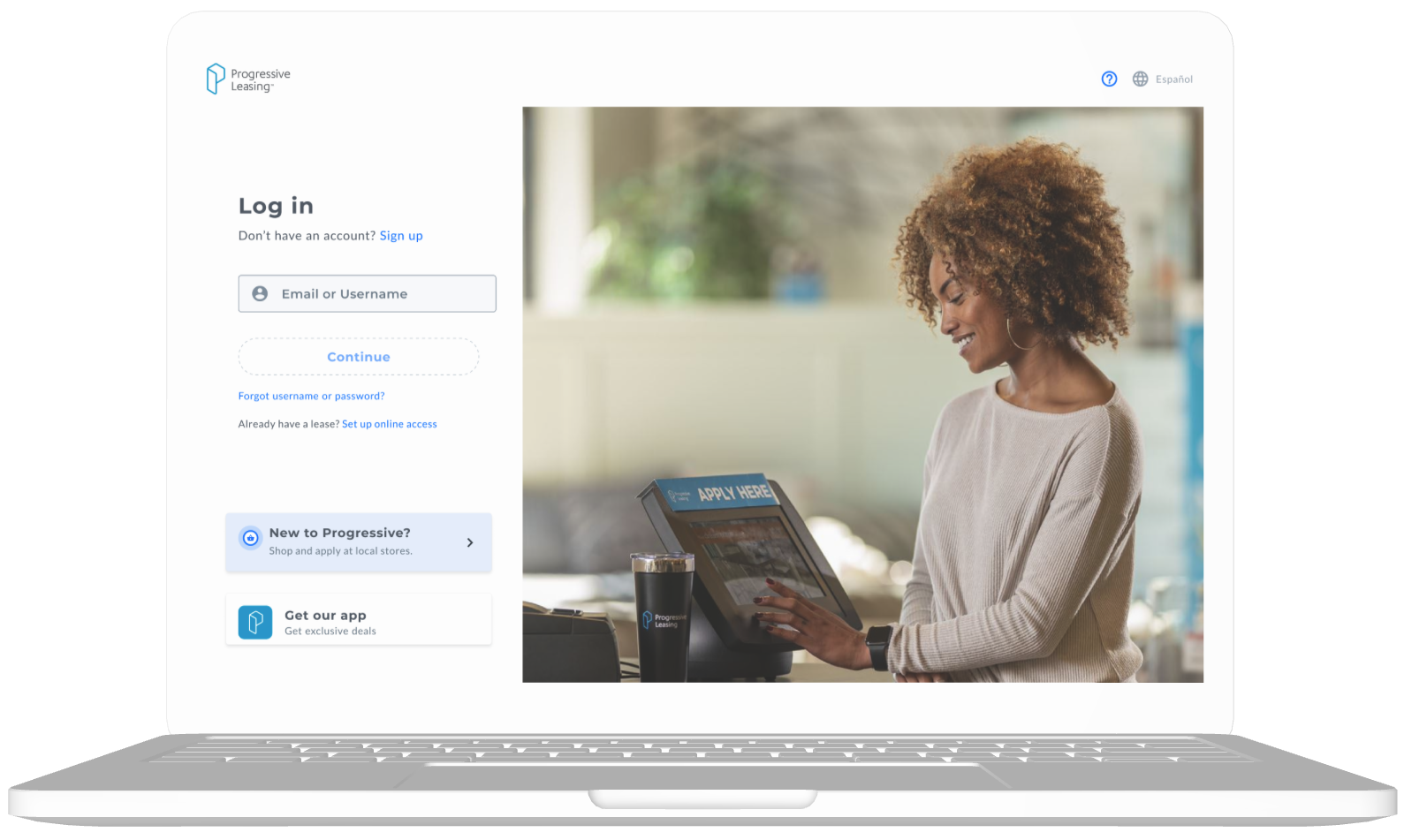
Log in
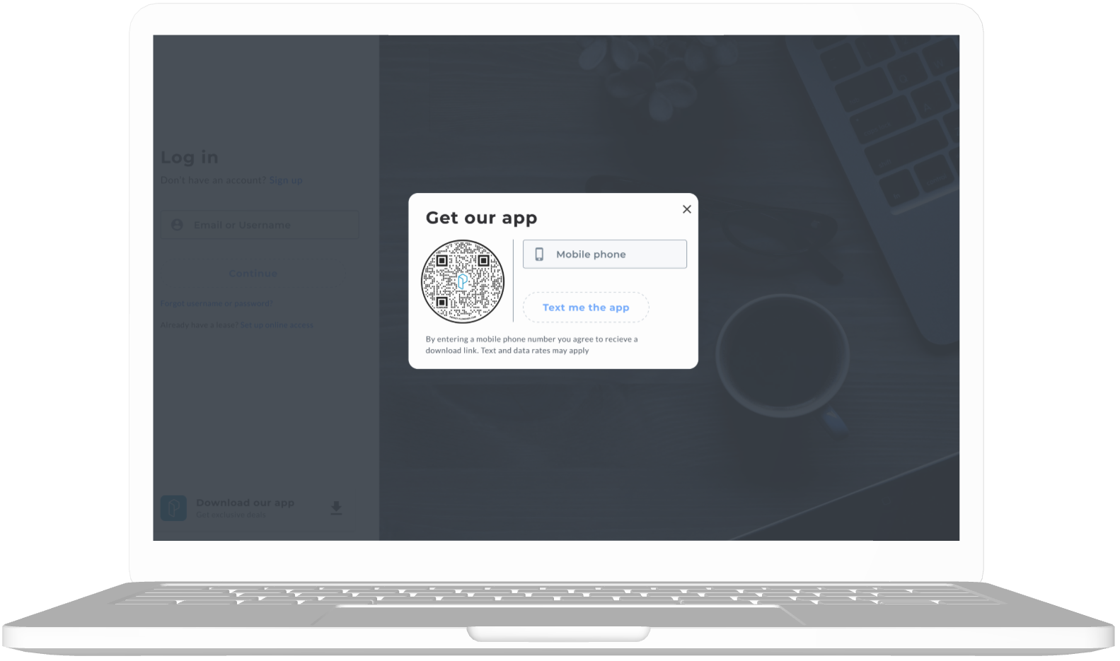
Log in modal
Dashboard
Results
Huge increase in downloads!
• Despite launching this in July we got an increase of 94,000 downloads y/y.
• Our goal for the year was 902,000 downloads and we got 94% of the way there despite launching half way through the year.
• As you can see after we launched we exceeded our forecast by around 10k each month.
Future
Plans for the future
We initially wanted to add the CTA to the homepage but there were a couple hurdles that got in the way and prevented us from doing that. So we planned on doing that in the future.
