

Background
Progressive Leasing
Progressive Leasing is a fintech company that partners with retailers nationwide to lease products to the credit challenged consumer. The product I worked on for them was their main consumer website & mobile application available on The App Store, and Google Play.
User Personas
Who will use this product?
"Michael" & "Maria" (Our main demographic) frequently posture a confident air, but often find themselves overwhelmed with their financial reality. With spending priorities and behaviors that can seem undisciplined, they frequently become financially overcommitted. Despite confidence in their financial skills and knowledge, they struggle with awareness of funding options(research), approval requirements(get denied), and affordability (late & missed payments). They want to be perceived as important, valued, and informed, while avoiding being perceived or treated as inferior.
Role
Working together as a team
I was on a team of 6 people. One product manager, 2 developers, and 3 product designers. The designers split up the work but both worked on each aspect of the solution, including research. While I did almost all the design, testing, and iterations.
Tools: Figma, Usertesting.com
Problem
Having to call in to customer service to change payment plan
• If the customers wanted to change their payment schedule they had to call into our customer service agents to do so. They did not have the ability to do that on the app or the website.
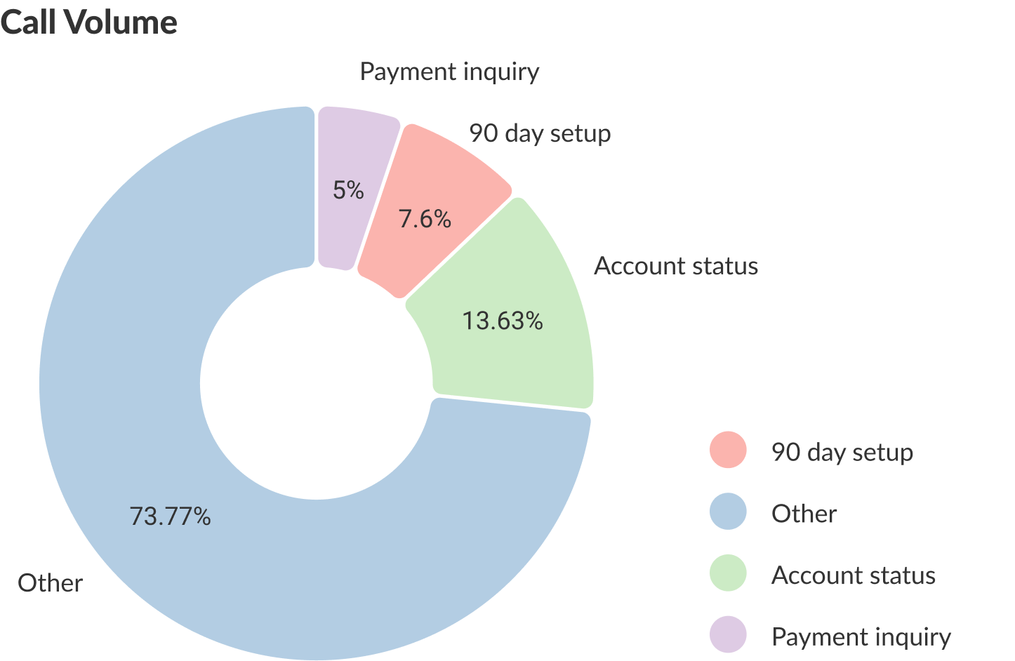
• 7.6% of total calls were for 90-day schedule setup (48,729 a year). Which is $243,606 a year just for 90-day setup calls. If we could reduce this number even 25% it would mean $60,000 in savings.
• The company was nervous about making it easier for the customer to change their payment schedule because it could result in many more people opting into this option which results in less profit per lease. However, we knew that the savings of getting less calls would help offset that loss. We also knew that showing the customers other options along with the 90 day option (least profitable), they would be more likely to take them resulting in more profit.
• We needed to get as much data as we could to help get the business feel comfortable to buy in.
• We needed to get as much data as we could to help get the business feel comfortable to buy in.
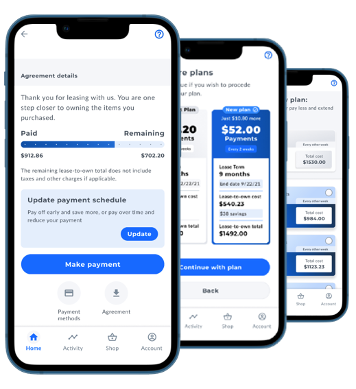
Solution
Self service
By giving the customers the ability to change their payment schedule themselves on the application or website, this would solve both problems of reducing customer service calls, and improving the experience for the customer.
Research
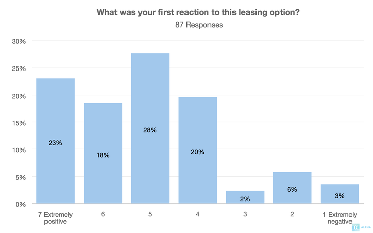
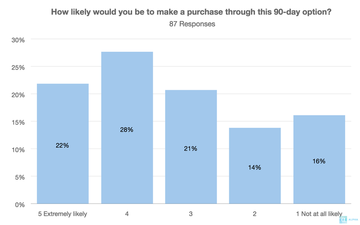
Surveys
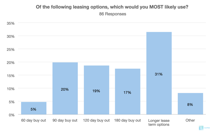
• According to a survey we launched 28% of customers want this feature.
• 64% of users surveyed say they would rather use the app to do this than call in.
• Below are some other result of our surveys
Research
Interviews
• We conducted two 30 minute interviews with customers who had recently called in to setup 90day schedule. These interviews helped us understand their experience trying to setup a new payment schedule. It helped us understand what they liked and disliked, and how the experience could be better.
• An important insight we found was that this process needs to be very clear and easy to understand as this type of thing is complex and can be hard to understand.
Empathy
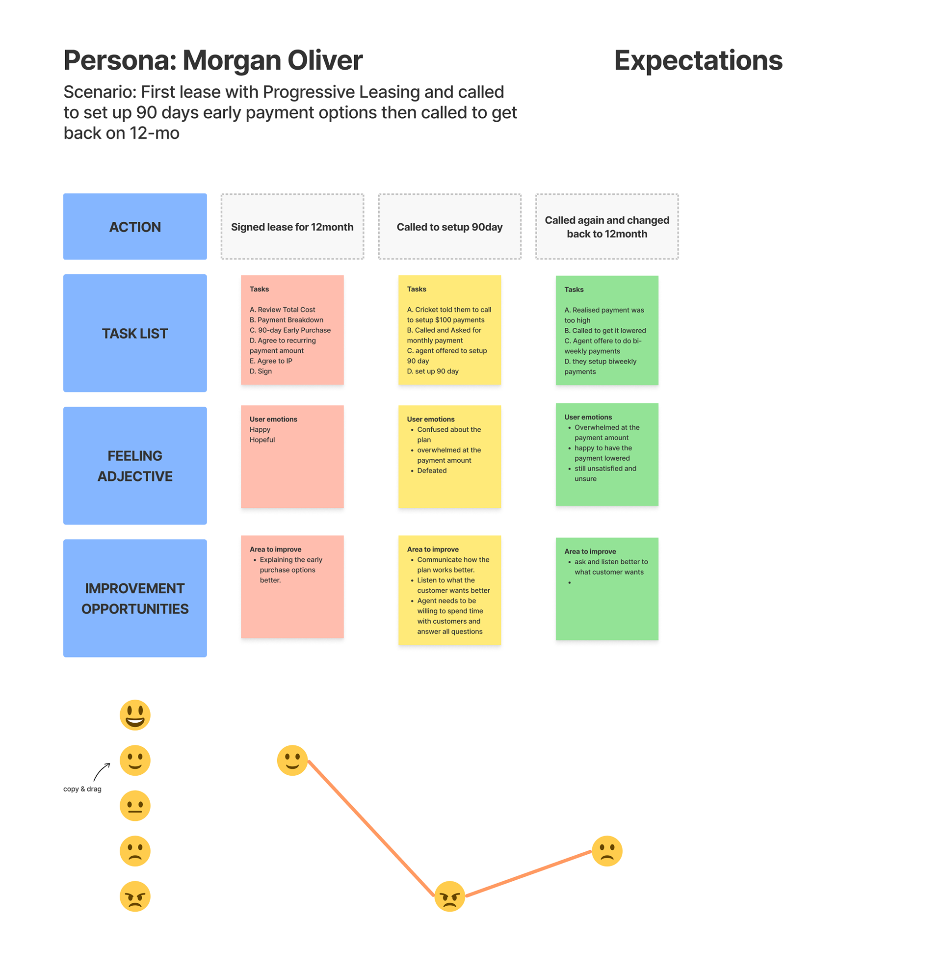
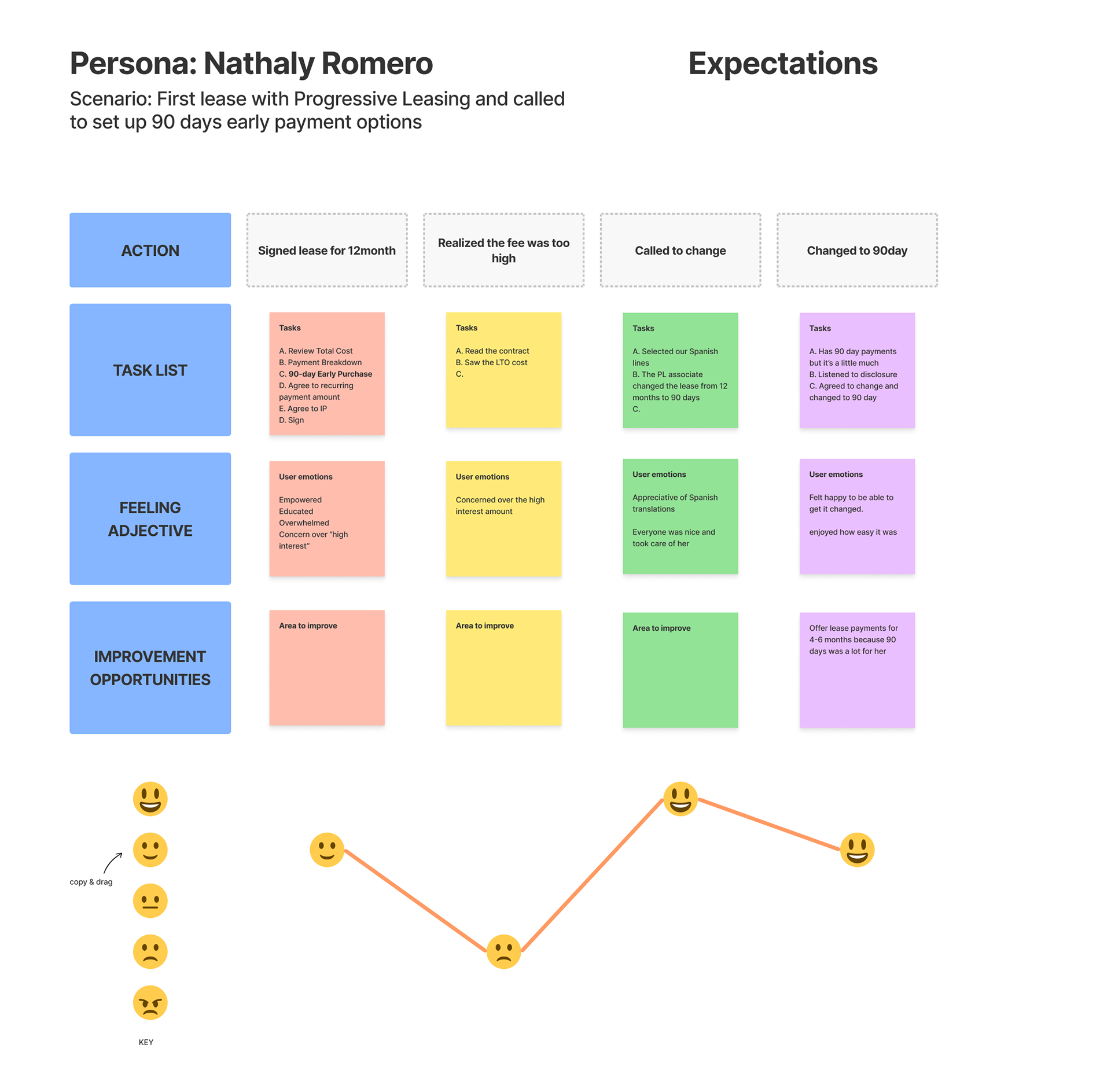
Emotional journey map
• We wanted to map the emotional journey the customer went through while trying to change their payment schedule to help the company understand how important this solution is. This helps us see what they were feeling during each step which identified the areas in need of improvement.
User Flow
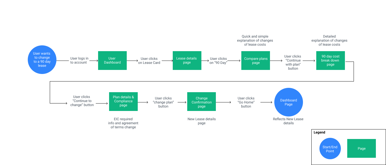
Mapping out the best experience
This helped us organize the users journey into an experience that would be simple, easy, and quick to accomplish the task of changing their payment schedule.
Design
Exploration
We did a lot of exploration (see below) trying to look at this from many different angles.
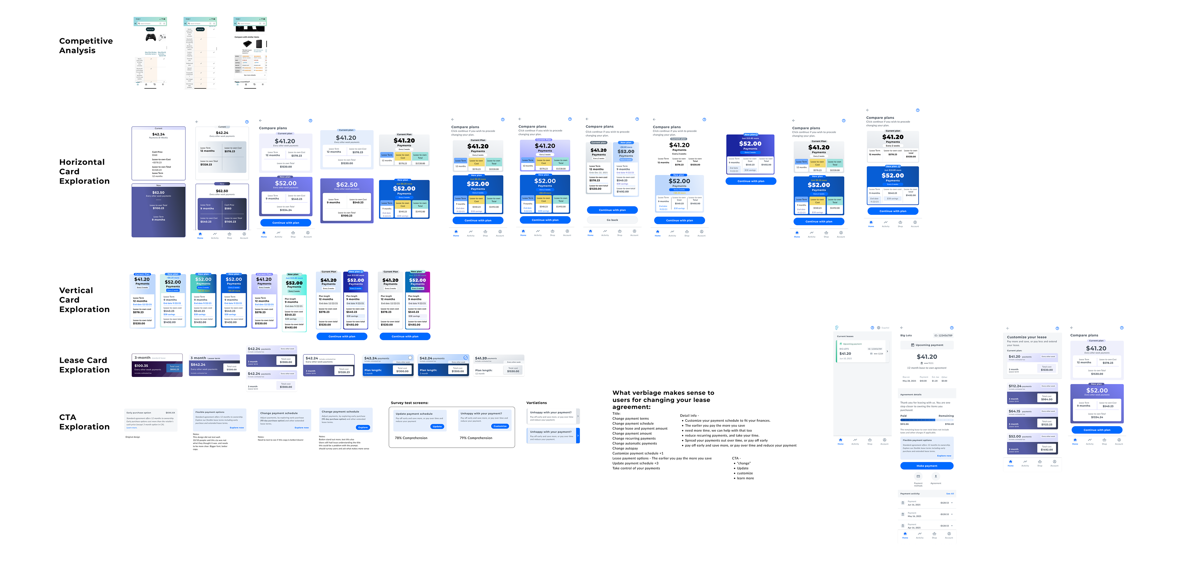
Design
High fidelity prototype
After much exploration we created a high fidelity prototype.


User testing
Usability test 1
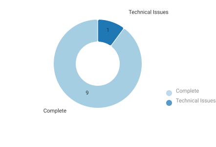
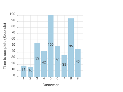
• We had 10 people test the usability of our solution on usertesting.com.
• 30% did not complete the task given.
•Major issues we found were:
• The CTA did not stand out enough and people seemed to skip right over it.
• The CTA copy was not clear and easy to understand. Many people thought it was for something else.
Iteration
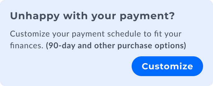
Improving the CTA
• I made some major improvements to the CTA to increase visibility, and comprehension.
• Changed the link to a big blue button to increase visibility.
• Changed size of title text and made it bolder.
• Adjusted copy to have a lower reading level, and changed language to be more common to the user.
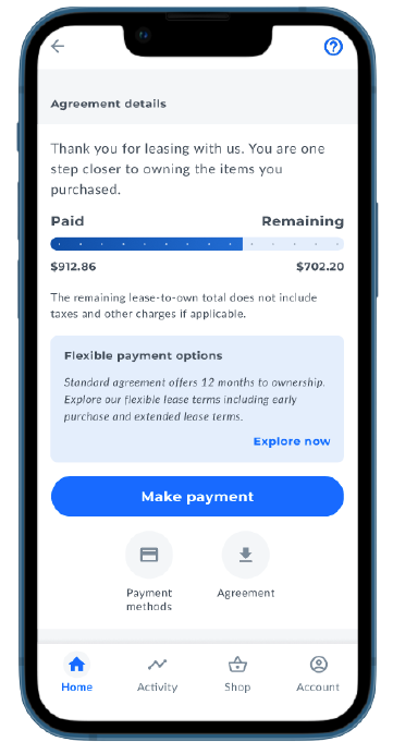
Before
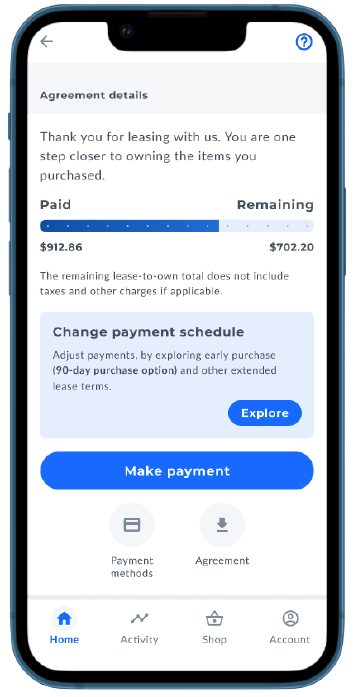
After
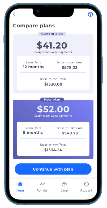
Improving the compare plan pages
• Changed the layout for easier comparison between data points.
• Changed the color to be more cohesive to the design system.
• Added some more data like the savings amounts, the difference in payments, and end date, to help user make a
more informed decision.

Before
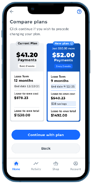
After
Improving the choose a plan page
• Changed the color to be more cohesive to the design system.
• Added radios to make the cards seem more selectable.
• Changed the Lease term text to be on top as more of a header for better clarity.
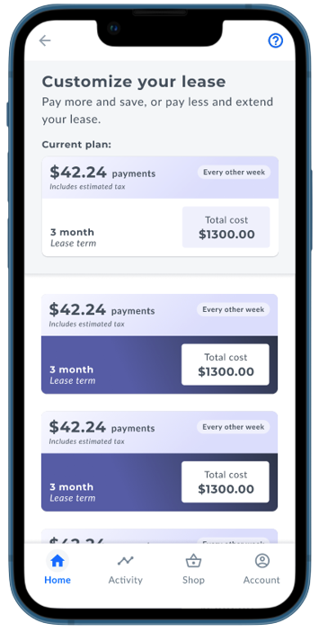
Before
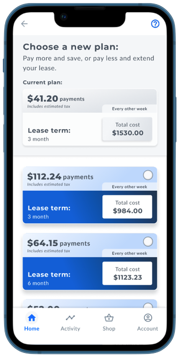
After
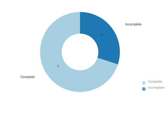
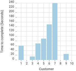
User testing
Usability test 2
• We had 10 people test the usability of our iteration on usertesting.com.
• 100% completed the task given. (30% increase)
• 22% decrease in average time to completion from last test.
• CTA still had issues with comprehension.
• Everyone saw the CTA and clicked on it but didn't understand exactly what it was saying.
Iteration
Improving the CTA (again)
• After 2 rounds of not being able to improve comprehension we took a different approach. I listened to around 100 customer calls, and noted down the vocabulary they used to describe Early Purchase Options and and tallied up the most popular words used. We then used those words to create a new CTA and took it to the Hemingway website to help us create copy that has a lower reading level.
Once we finalized this CTA we took it to compliance and had them look at it for approval.
Then we narrowed down all our ideas to just 2 and took those ideas and did an A/B test asking our actual customers what would happen when they clicked the CTA. After 150 responses both designs came out with even comprehension levels. Both responses had 78% comprehension rate. Which is way better than the previous designs.

Summary
What I Learned
This project started out with the goal to decrease customer service calls, and give customers the power to change their payment schedule themselves through a quick, easy, and empowering experience.
Through research and interviews with actual customers, we understood that the experience needed to be very clear and easy to understand.
Using our research, vision statement, user flows, divergent, and convergent thinking we created a solution. After testing and iteration were confident that our solution will work to accomplish our original goal.
This is in development right now and should be released into the Progressive leasing app and website Q3 of 2022.
